Attention "dusty"!
This article is already a little outdated and may contain information that no longer corresponds to the current status of the topic.
You have probably heard that your website needs to be "mobile friendly". You have probably also heard terms such as "responsive design" or "adaptive design". Possibly even "fixed layout" and "fluid layout". At the other extreme are mega displays, on which your website should look just as good. There are various methods for optimizing your website for all screen resolutions.
In this article, we want to explain what options are available, discuss their advantages and disadvantages and give you tips for choosing the best solution.
Why mobile friendly?
According to the ARD-ZDF online study, mobile use of the internet continued to increase in 2015. Today, 55% of Germans use the mobile internet every day - 5% more than in 2014. Most users are aged between 14 and 29 (48%), while the 30-49 age group accounts for 23%.
The mobile internet is primarily used to check and send emails or messenger messages. This is immediately followed by searching for information and reading articles.
In October 2015, Google published its "Quality Raters Guide", which had undergone a "mobile rewrite". It states that websites that are not mobile-friendly (i.e. do not adapt to the conditions of a mobile device) are rated poorly. This can result in a loss of ranking in the mobile search results for non-optimized websites.
As you can see: There are several reasons to optimize your own site for mobile devices. We checked over 100 websites from various industries and found that only around 49.1% of the websites were mobile-friendly or optimized for all screen resolutions. Apparently, the potential has not yet been fully exploited.
What possibilities are there?
Developers do not agree on the different terms. Many use the term "responsive web design" to refer to the general adaptability of the website for different output devices, without thinking about the technical implementation. Others assume that responsive design uses a "fluid layout", while the term "adaptive design" is equated with a fixed layout. The wording here is not yet fixed and the terminology will certainly change depending on technological progress.
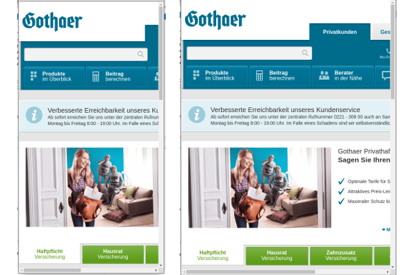
At the current state of technology, we are most comfortable with the definitions on https://liquidapsive.com/ . The creator, Nicholas Davison, distinguishes between adaptive design and responsive design as well as static (fixed) layout and liquid (fluid) layout: Static/fixed layouts correspond to the "old websites" as they have been developed up to now. They are characterized by the fact that changing the screen size does not change the layout. Here, the elements are assigned sizes in (absolute) pixel specifications. The problem is that you have to scroll horizontally on small screens in order to see all the content.
Here is an example of a static layout:

Liquid / Fluid layouts adapt smoothly depending on the screen size. The sizes are specified here as percentages. Instead of assigning a width of 500 px to a box, for example, the width of 25% (of the total width) is specified here. The problem here is that very large and very small browser windows lead to unsightly distortions if the page was not designed for these sizes:

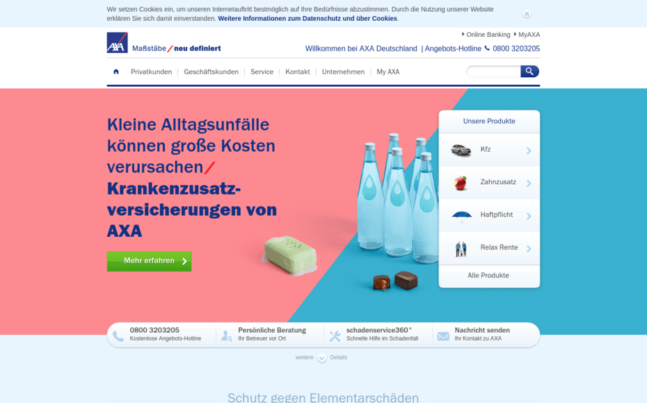
Adaptive design is characterized by different breakpoints for different resolutions. A new, static layout is loaded for each breakpoint. While a layout is active, nothing changes if the window size is changed. As soon as the window size falls below the breakpoint, a new layout is loaded. The layout change happens abruptly, as this method basically uses a series of static layouts.here is an example of a page that was designed adaptively:


Only the margin spacing on the right and left changes when the size is reduced. However, the elements on the page remain the same. A new layout is loaded as soon as this size is undercut:

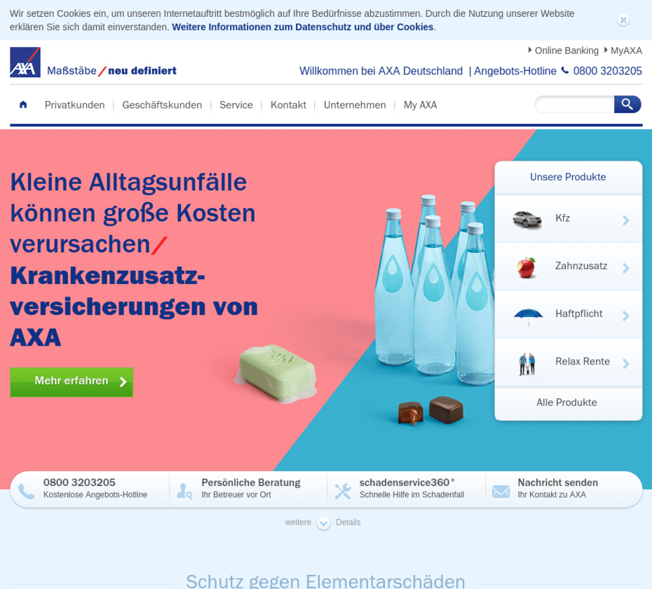
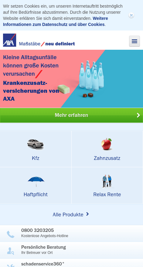
Responsive design also uses breakpoints for different resolutions. However, the method uses a series of fluid layouts: while a layout is active, the content changes smoothly according to the screen size. However, as soon as a breakpoint is undershot, a new layout is also loaded. Here is an example of a responsive design:


Within this layout, the elements adapt to the screen size. As soon as the screen size falls below the breakpoint, the next layout is loaded. The content of the page no longer consists of 3 but 2 columns:

Which industries use which methods?
In our study, in which our web designers from Stuttgart tested over 100 websites, 50.9% had rigid designs. The remaining 49.1% were distributed more towards responsive design:
| Industry | Rigid design | Responsive design | Adaptive design |
|---|---|---|---|
| Electrical industry | 64% | 21% | 15% |
| Insurance | 8% | 60% | 32% |
| Banks | 49% | 28% | 23% |
| Retail trade | 56% | 28% | 16% |
| Online stores | 61% | 35% | 4% |
| Car manufacturers | 52% | 40% | 8% |
| Car dealer | 58% | 40% | 2% |
| Agencies | 52% | 48% | 0% |
| Educational institutions | 74% | 16% | 10% |
| Publishing houses | 35% | 61% | 4% |
| total | 50,9% | 37,7% | 11,4% |
Which method is better for me?
The main advantage of adaptive design is its simplicity:
- Fixed dimensions allow design to be carried out using image editing programs.
- This means that the communication effort is very low
- The technical complexity is low.
- Each layout can be optimally tailored to its resolution range, which improves the user experience.
- Little time and effort required
- Testing the site is very easy
The disadvantages are those of "conventional" rigid web designs, but above all:
- Not all resolutions or devices can be taken into account in the design, so the display may not be perfect on some devices.
If this disadvantage is not so significant for your website, this form of adaptable website can make sense for you. If this method is implemented correctly, your visitors can benefitfrom an excellent user experience and usability.
The advantages of responsive design lie in its universality:
- Automatic adaptation to any window size.
- No wasted space in the window.
- You don't have to worry about future devices and their resolutions, as the adaptation also works there.
The disadvantages lie in the complexity:
- You can't work with simple mockups. Prototypes often have to be built for the customer to illustrate how the page and its elements will behave.
- Design, technical implementation and adaptation of the content are more complex.
- The implementation is more complex.
With responsive design, the focus is on the content, not the device. You should opt for this method if you want to be on the safe side technically.
We are happy to support you with your project if you want to optimize your website for all screen resolutions. arocom also has experience with high-traffic B2B websites from industry and can advise you on the best implementation method and guide you through the entire project.


